

Color Contrast Checker – WCAG 2.2 AA and AAA Contrast Ratio
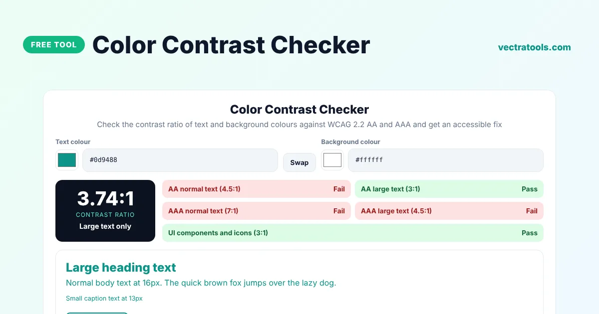
Color Contrast Checker
Check the contrast ratio of text and background colours against WCAG 2.2 AA and AAA and get an accessible fix
Large heading text
Normal body text at 16px. The quick brown fox jumps over the lazy dog.
Small caption text at 13pxButton label
Quick answer
A color contrast checker measures how readable text is on its background. Enter a text colour and a background colour and the tool shows the contrast ratio, from 1:1 to 21:1, and whether it passes WCAG 2.2 level AA and AAA for normal text, large text and interface elements. If it fails, the tool suggests a darker or lighter colour that passes.
Our free color contrast checker uses the official WCAG relative luminance formula, the same one used by accessibility auditors and browser dev tools. It includes a live preview with heading, body, caption and button text, a swap button, and an automatic fix that keeps your hue while reaching the 4.5:1 AA target.
WCAG Contrast Requirements
| Level | Normal text | Large text | UI components |
|---|---|---|---|
| AA | 4.5:1 | 3:1 | 3:1 |
| AAA | 7:1 | 4.5:1 | Not defined |
Large text means at least 24px regular or about 18.7px bold. Most websites aim for level AA, which is also the level named in many accessibility laws and guidelines.
What the Color Contrast Checker Shows
- The exact contrast ratio between your two colours.
- Pass or fail for AA and AAA, for normal and large text.
- Pass or fail for icons, borders and form controls (3:1).
- A live preview of headings, body text, captions and a button.
- A suggested text colour that passes AA, which you can apply in one click.
How to Use the Color Contrast Checker
Step 1: Enter the Text and Background Colours
Pick the text colour and background colour with the swatches or type HEX, rgb() or hsl() values. Click Swap to switch them.

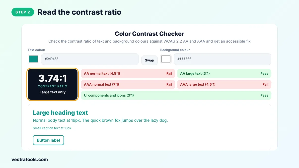
Step 2: Read the Contrast Ratio
The dark panel shows the contrast ratio and a quick grade, from Poor to Excellent.
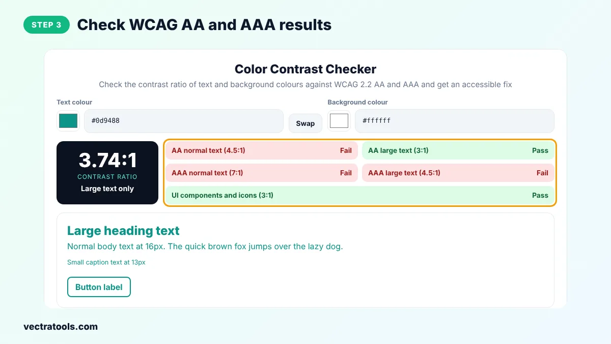
Step 3: Check WCAG AA and AAA Results
Green boxes pass and red boxes fail. Check normal text, large text and UI components against both AA and AAA.
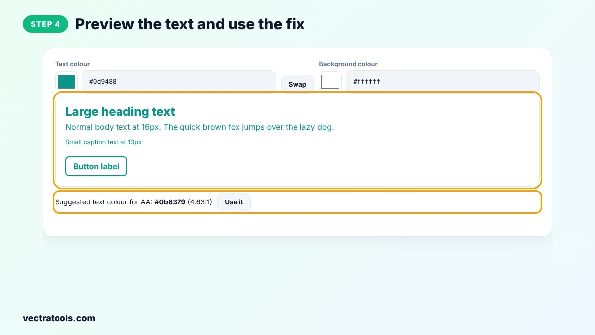
Step 4: Preview the Text and Use the Fix
See how real text looks in your colours. If the pair fails, click Use it to apply the suggested colour that reaches 4.5:1.
Designers, developers and content editors use a color contrast checker before publishing, because low contrast is one of the most common accessibility problems on the web. The color contrast checker helps people with low vision, colour blindness and anyone reading on a phone in bright sunlight.
How the Contrast Ratio Is Calculated
Each colour is converted to its relative luminance, a value from 0 for black to 1 for white that reflects how bright the colour looks to the human eye. The ratio is (L1 + 0.05) / (L2 + 0.05), where L1 is the lighter colour. Black on white gives the maximum of 21:1, and two identical colours give 1:1.
Color Contrast Checker Tips
- Brand colours such as bright teal, orange or yellow often fail on white. Use a darker shade for text and keep the bright one for backgrounds or large headings.
- Placeholder text and disabled buttons also count. Check them too.
- Do not rely on colour alone to show meaning, such as red for errors. Add an icon or text.
- Check text on images by testing the lightest part of the image behind the text.
Frequently Asked Questions
What is a good contrast ratio?
At least 4.5:1 for normal text and 3:1 for large text meets WCAG AA. 7:1 for normal text meets the stricter AAA level.
What is WCAG?
The Web Content Accessibility Guidelines are the international standard for accessible websites, published by the W3C. Version 2.2 is the latest.
Does the contrast ratio formula differ between WCAG 2.1 and 2.2?
No. WCAG 2.2 uses the same contrast formula and thresholds as WCAG 2.1.
What counts as large text?
Text that is at least 24px regular weight, or at least about 18.7px (14pt) bold.
Do logos need to meet contrast rules?
No. Logos and brand names are exempt, as is decorative text that carries no information.
How does the tool suggest a fix?
It keeps the hue and saturation of your text colour and changes the lightness step by step until the ratio reaches 4.5:1.
Is this color contrast checker free?
Yes. It is free, needs no account and runs in your browser.