

CSS Box Shadow Generator – Create Box Shadows Visually
CSS Box Shadow Generator
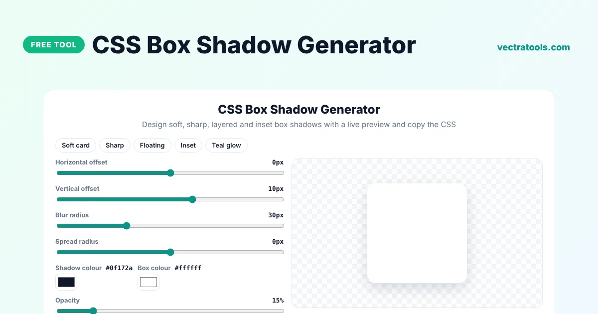
Design soft, sharp, layered and inset box shadows with a live preview and copy the CSS
Quick answer
A box shadow generator lets you design a CSS shadow with sliders instead of guessing numbers. Set the horizontal and vertical offset, blur, spread, colour and opacity, and the tool writes the box-shadow rule for you. Copy it into your stylesheet to give cards, buttons and images depth.
Our free CSS box shadow generator shows a live preview, supports inset shadows and an optional second soft layer for a more natural look, and includes presets such as Soft card, Floating and Teal glow. It outputs the shadow colour as rgba so the opacity is easy to change later.
How the box-shadow Property Works
box-shadow: [inset] x-offset y-offset blur spread colour;| Value | What it does |
|---|---|
| x-offset | Moves the shadow right (positive) or left (negative) |
| y-offset | Moves the shadow down (positive) or up (negative) |
| blur | How soft the edge is. 0 gives a hard edge |
| spread | Makes the shadow bigger (positive) or smaller (negative) than the box |
| colour | Usually rgba so you can set the opacity |
| inset | Draws the shadow inside the box instead of outside |
What You Can Do with the Box Shadow Generator
- Create soft card shadows, sharp retro shadows and floating effects.
- Make inset shadows for pressed buttons and input fields.
- Add a second, tighter shadow layer for a realistic, layered look.
- Change the box colour to test the shadow on light or coloured cards.
- Use Random to explore ideas and Reset to go back to the default.
How to Use the CSS Box Shadow Generator
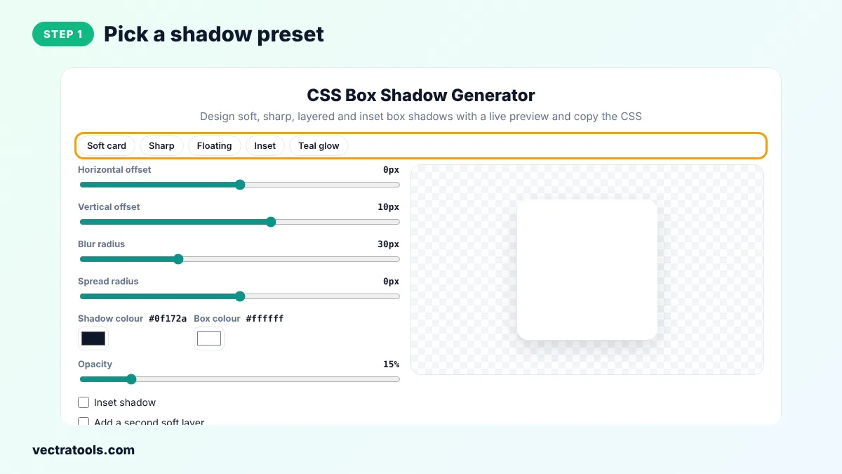
Step 1: Pick a Shadow Preset
Click Soft card, Sharp, Floating, Inset or Teal glow to start from a ready-made shadow, or keep the default values.
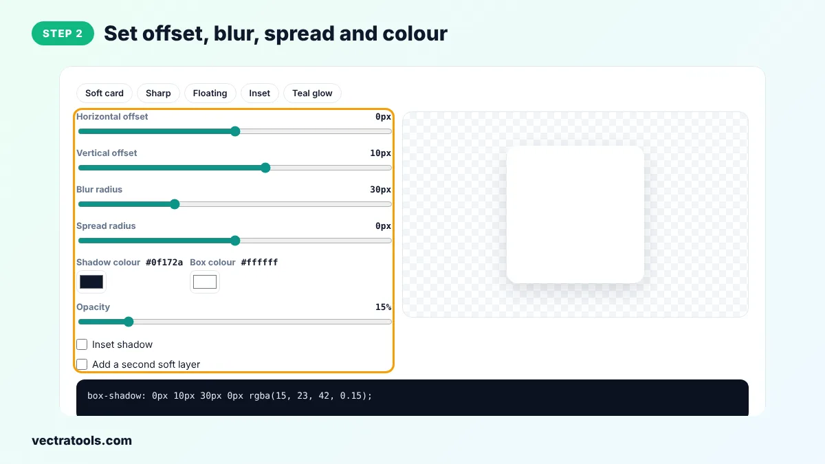
Step 2: Set Offset, Blur, Spread and Colour
Drag the sliders for horizontal and vertical offset, blur and spread, pick a shadow colour and set the opacity. Tick Inset shadow or Add a second soft layer if you need them.
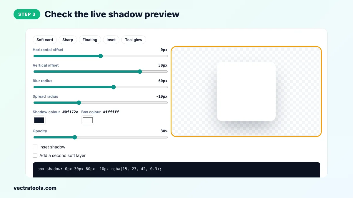
Step 3: Check the Live Shadow Preview
The white box on the right updates instantly, so you can judge how soft or strong the shadow looks.
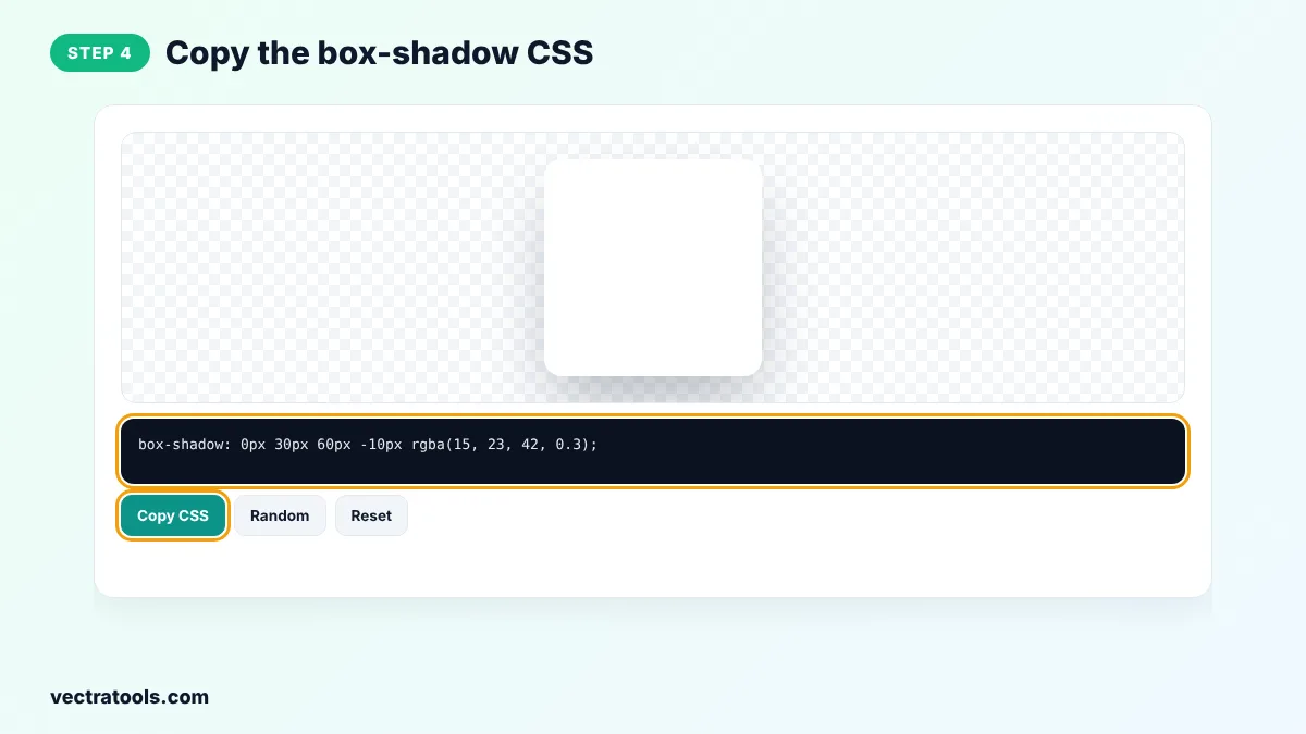
Step 4: Copy the box-shadow CSS
Click Copy CSS and paste the box-shadow rule into the CSS of your card, button or image.
Designers often spend minutes nudging shadow values by hand. With the box shadow generator you see every change at once, so you can match a design file quickly. The box shadow generator is free to use for any project, with no sign-up and no watermark in the code.
Common Box Shadow Mistakes
- Using pure black at full opacity, which looks harsh and old-fashioned.
- Adding the same large shadow to every element, so nothing stands out.
- Forgetting that a shadow on an element with overflow: hidden on its parent can be cut off.
- Putting a big shadow on text inputs, which makes them look like buttons.
Box Shadow Examples
| Style | CSS |
|---|---|
| Subtle card | box-shadow: 0 1px 3px rgba(0, 0, 0, 0.12); |
| Raised card | box-shadow: 0 10px 30px rgba(15, 23, 42, 0.15); |
| Hard retro | box-shadow: 6px 6px 0 #0f172a; |
| Pressed input | box-shadow: inset 0 2px 4px rgba(0, 0, 0, 0.15); |
| Glow | box-shadow: 0 0 20px rgba(13, 148, 136, 0.5); |
Box Shadow Generator Tips
- Real shadows are soft and low in opacity. Values between 0.08 and 0.2 usually look best on light backgrounds.
- A larger y-offset with a large blur makes an element look higher above the page.
- Use a negative spread with a big blur to keep the shadow from showing at the sides.
- Use a tinted shadow, for example dark blue instead of black, to match a coloured design.
- Too many large shadows can slow down scrolling on low-end phones, so keep them for key elements.
The box shadow generator only writes standard CSS, so the code works in every modern browser without prefixes.
Frequently Asked Questions
How do I add a shadow to a box in CSS?
Use the box-shadow property, for example box-shadow: 0 10px 30px rgba(0, 0, 0, 0.15). The box shadow generator creates this code from your slider settings.
What is the difference between blur and spread?
Blur controls how soft the edge of the shadow is. Spread changes the size of the shadow before it is blurred.
How do I make an inner shadow?
Add the inset keyword at the start of the value, or tick Inset shadow in the tool.
Can I use more than one box shadow?
Yes. Separate several shadows with commas. Tick Add a second soft layer to see a layered shadow.
Why does my shadow look grey and dirty?
The opacity is probably too high. Lower it, or use a dark tint of your background colour instead of pure black.
What is the difference between box-shadow and drop-shadow?
box-shadow follows the rectangle of the box, while the drop-shadow filter follows the actual shape of transparent images such as PNG icons.
Is this box shadow generator free?
Yes. It is free, needs no sign-up and runs in your browser.