

CSS Border Radius Generator – Round Corners Visually
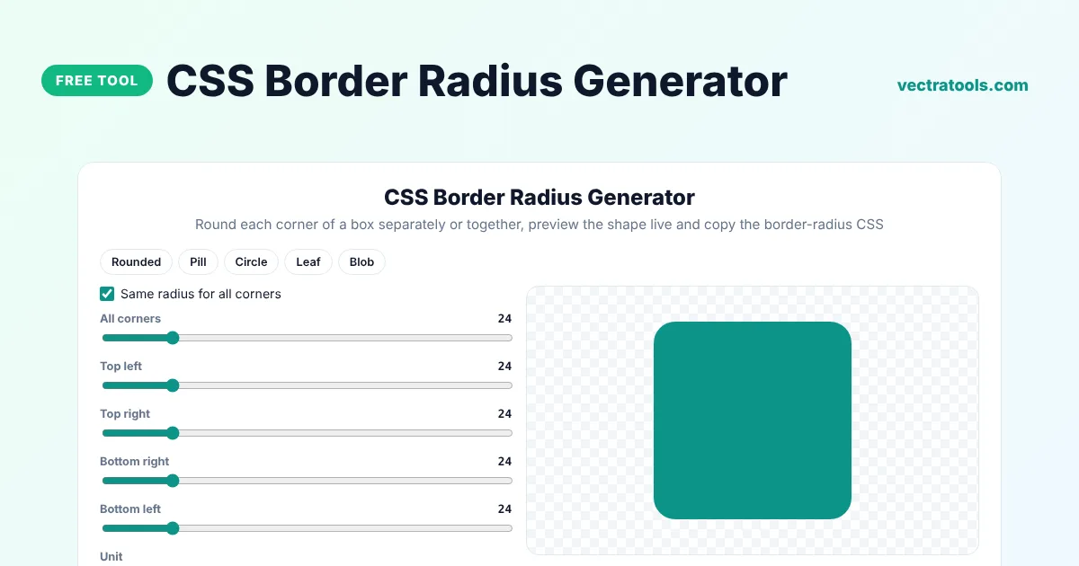
CSS Border Radius Generator
Round each corner of a box separately or together, preview the shape live and copy the border-radius CSS
Quick answer
A border radius generator helps you round the corners of an element and gives you the border-radius CSS. Set one value for all corners or a different value for each one, choose px, % or rem, and copy the shortest valid rule. Use it for cards, buttons, avatars, pills and organic blob shapes.
Our free CSS border radius generator shows the shape live, has presets for rounded boxes, pills, circles, leaves and blobs, and automatically writes the shortest form of the property, such as one value when all corners match or two values for opposite pairs.
How border-radius Values Work
| Code | Result |
|---|---|
border-radius: 12px; | All four corners rounded by 12px |
border-radius: 12px 0; | Top left and bottom right 12px, the other two square |
border-radius: 10px 20px 30px 40px; | Top left, top right, bottom right, bottom left, in that order |
border-radius: 50%; | A circle on a square element, or an ellipse on a rectangle |
border-radius: 999px; | A pill shape on a button or badge |
What the Border Radius Generator Can Make
- Rounded cards and panels with the same radius on every corner.
- Pill-shaped buttons, tags and badges.
- Perfect circles for avatars and icons.
- Leaf and speech-bubble shapes with only some corners rounded.
- Organic blob shapes using percentage values.
How to Use the CSS Border Radius Generator
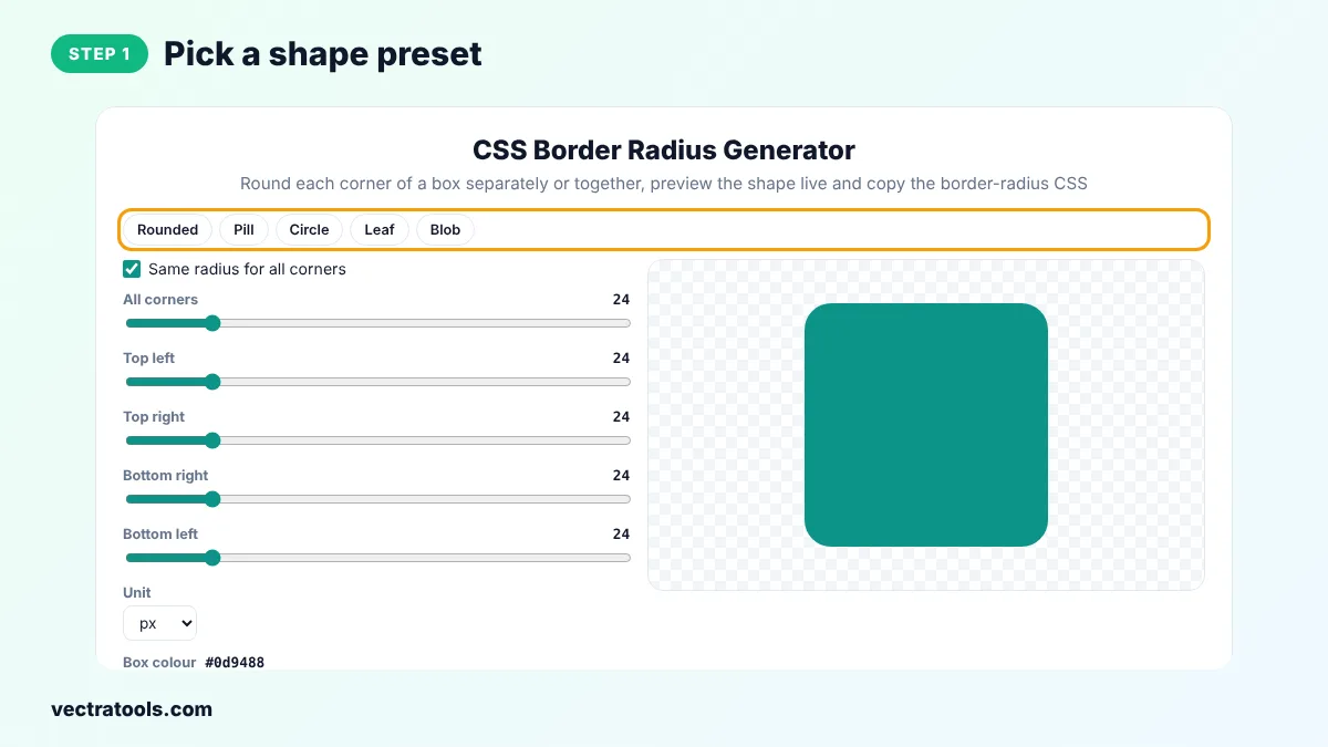
Step 1: Pick a Shape Preset
Click Rounded, Pill, Circle, Leaf or Blob to load a shape, or start from the default rounded box.
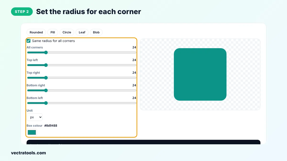
Step 2: Set the Radius for Each Corner
Keep Same radius for all corners ticked and drag All corners, or untick it and set Top left, Top right, Bottom right and Bottom left separately. Choose px, % or rem as the unit.
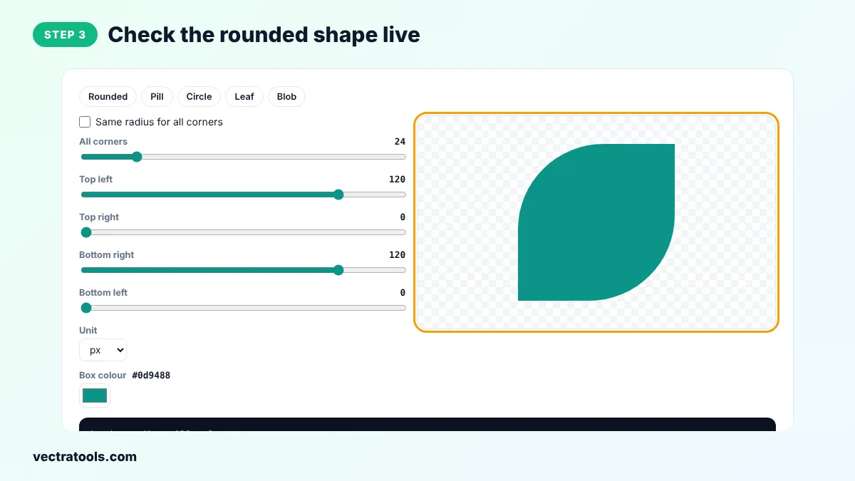
Step 3: Check the Rounded Shape Live
The coloured box on the right changes as you move the sliders. Change the box colour to see the shape more clearly.
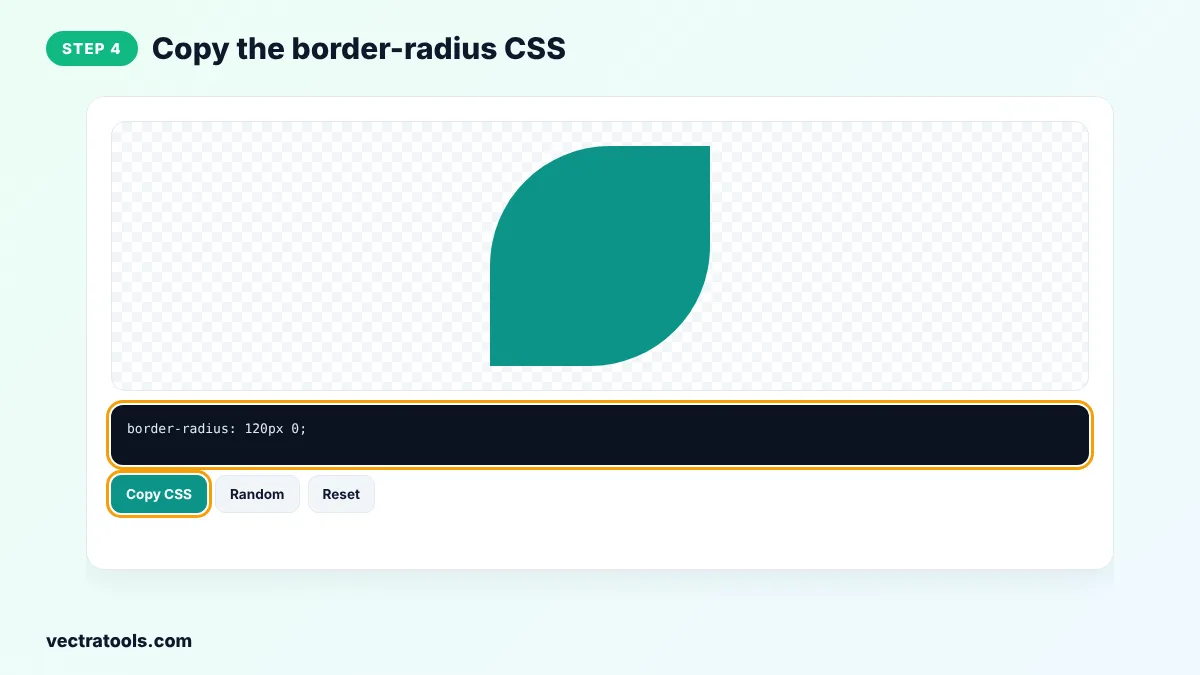
Step 4: Copy the border-radius CSS
Click Copy CSS to copy the rule. The border radius generator writes the shortest valid form, ready to paste into your stylesheet.
Front-end developers, designers and students use the border radius generator to test shapes before writing them into a design system. The border radius generator is free, works offline once the page has loaded and gives code you can paste into plain CSS, Sass, Tailwind arbitrary values or inline styles.
Common Border Radius Mistakes
- Using 50% on a rectangle and expecting a circle. It makes an ellipse.
- Rounding a container but not clipping its image, so the corners of the image stick out.
- Mixing many different radius values on one page, which makes the design look inconsistent.
- Using px values on very small elements, where a large radius turns them into dots.
Px, Percent or Rem?
- px keeps the same rounding whatever the element size. Best for cards and buttons.
- % is relative to the element size. 50% makes circles and ellipses, and mixed percentages make blobs.
- rem scales with the root font size, which keeps rounding in step with your typography.
Border Radius Generator Tips
- Match the radius of inner elements to the outer one minus the padding, so nested corners look even.
- Add overflow: hidden to a rounded container so images inside follow the corners.
- For a circle, the element must be square and have border-radius: 50%.
- Small radii of 4px to 12px look professional on most interfaces, while larger radii feel friendlier and more playful.
- Use the same few radius values across your site to keep the design consistent.
The border radius generator outputs plain CSS that works in all modern browsers without vendor prefixes.
Frequently Asked Questions
What does border-radius do in CSS?
border-radius rounds the corners of an element's outer border edge. It also clips the background to the rounded shape.
How do I make a circle with CSS?
Give the element the same width and height and set border-radius: 50%. Pick the Circle preset to see it.
In which order are the four values?
Top left, top right, bottom right, bottom left, going clockwise from the top left corner.
How do I round only the top corners?
Use border-radius: 12px 12px 0 0, or untick Same radius for all corners and set only Top left and Top right.
Why is my image not following the rounded corners?
Add overflow: hidden to the rounded parent, or put the border-radius directly on the image.
Can I make a pill-shaped button?
Yes. Use a very large radius such as 999px. The Pill preset does this for you.
Is this border radius generator free?
Yes. It is free to use, needs no account and works in your browser.