

CSS Flexbox Generator – Build Flex Layouts Visually
CSS Flexbox Generator
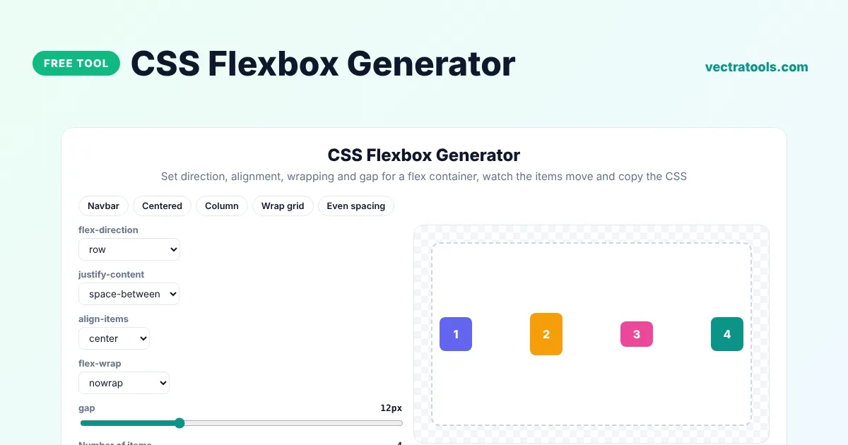
Set direction, alignment, wrapping and gap for a flex container, watch the items move and copy the CSS
Quick answer
A flexbox generator lets you build a CSS flex layout by choosing options from menus instead of remembering property names. Pick the direction, how items are spaced with justify-content, how they line up with align-items, whether they wrap and the gap, then copy the .container CSS. The preview shows the items move as you change each setting.
Our free CSS flexbox generator is a quick way to learn flexbox and to build real layouts such as navigation bars, centred content, card rows and toolbars. It includes presets, lets you change the number of items and writes clean CSS you can paste straight into your project.
Flexbox Properties Explained
| Property | What it controls | Common values |
|---|---|---|
| flex-direction | The main axis the items follow | row, column |
| justify-content | Spacing of items along the main axis | flex-start, center, space-between |
| align-items | Alignment of items on the cross axis | stretch, center, flex-end |
| flex-wrap | Whether items move onto new lines | nowrap, wrap |
| gap | Space between items | 12px, 1rem |
Layouts You Can Build with the Flexbox Generator
- A navbar with a logo on the left and links on the right (space-between).
- Content centred horizontally and vertically (center and center).
- A vertical stack of cards or form fields (column).
- A wrapping row of tags or product cards (wrap).
- Toolbars with evenly spaced buttons (space-evenly).
How to Use the CSS Flexbox Generator
Step 1: Pick a Flexbox Layout Preset
Click Navbar, Centered, Column, Wrap grid or Even spacing to load a common layout.

Step 2: Set Direction, Justify, Align and Wrap
Choose flex-direction, justify-content, align-items and flex-wrap from the menus, drag the gap slider and change the number of items to test your layout.

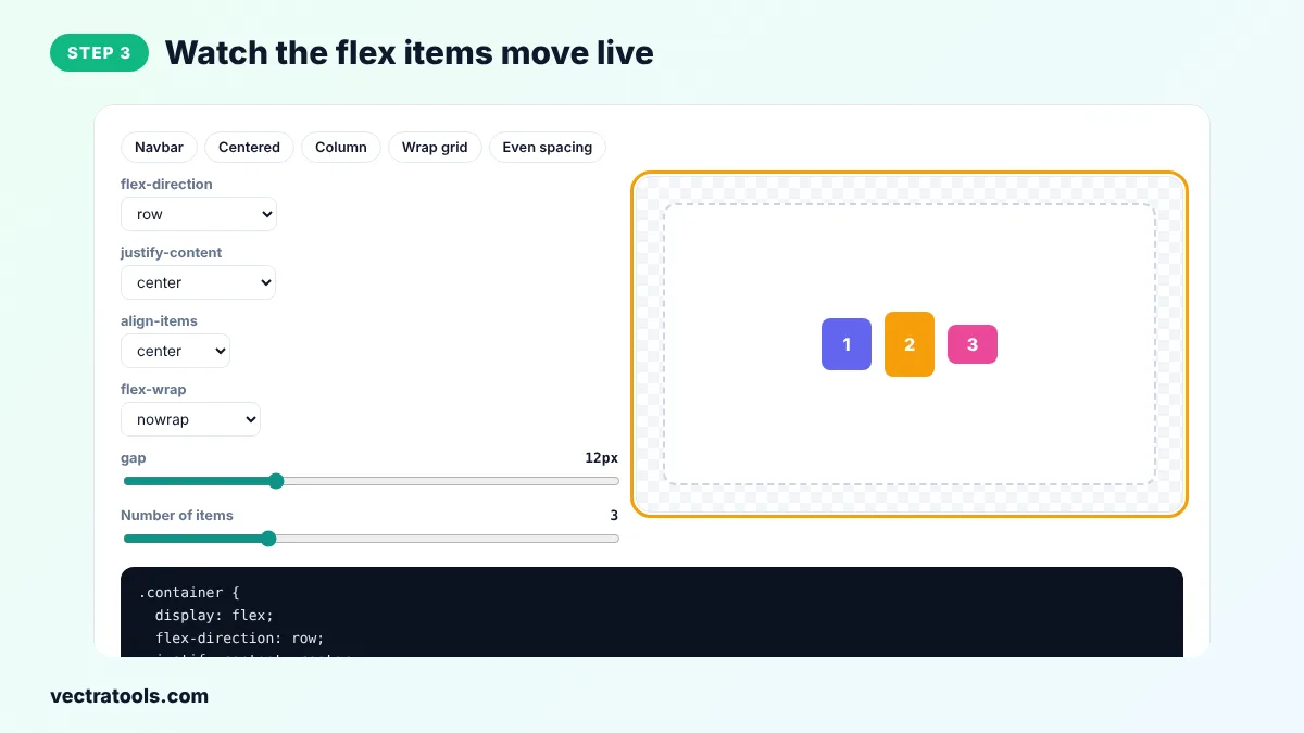
Step 3: Watch the Flex Items Move Live
The numbered boxes in the preview move instantly, which makes it easy to understand what each property does.
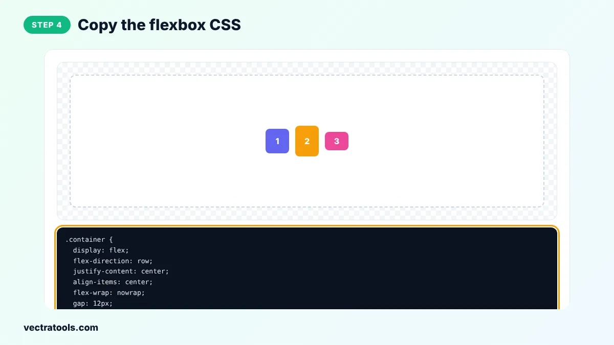
Step 4: Copy the Flexbox CSS
Click Copy CSS and paste the .container rule into your stylesheet. Add class="container" to the parent element of your items.
Developers who are new to flexbox often mix up the main axis and the cross axis. The flexbox generator makes this clear because you see the items move the moment you change a setting. The flexbox generator is free, needs no sign-up and gives code you can paste into any stylesheet, CSS module or styled component.
Common Flexbox Mistakes
- Putting display: flex on the items instead of on their parent container.
- Expecting align-items: center to work when the container has no extra height.
- Using margins for spacing when gap would be simpler.
- Forgetting flex-wrap: wrap, so items squeeze together on small screens.
Flexbox vs CSS Grid
Flexbox works in one direction at a time, a row or a column, which makes it ideal for navigation bars, button groups and aligning items inside a component. CSS Grid works in two directions at once and suits full page layouts and galleries. Many sites use both: Grid for the page and flexbox inside each section.
Flexbox Generator Tips
- When flex-direction is column, justify-content works vertically and align-items works horizontally.
- Use gap instead of margins between flex items. It is simpler and works in all modern browsers.
- align-items: center needs the container to be taller than the items, otherwise nothing seems to change.
- Add flex: 1 to a child item to make it fill the remaining space.
- Turn on wrap for rows of cards so they move to a new line on small screens.
The flexbox generator outputs standard CSS that works in every modern browser.
Frequently Asked Questions
What is CSS flexbox?
Flexbox is a CSS layout model that arranges items in a row or column and handles spacing and alignment for you. You turn it on with display: flex on the parent element.
How do I centre an element with flexbox?
Set display: flex, justify-content: center and align-items: center on the parent. Pick the Centered preset in the flexbox generator to see it.
What is the difference between justify-content and align-items?
justify-content spaces items along the main axis, which is horizontal in a row. align-items aligns them on the cross axis, which is vertical in a row.
Why is my flex item not wrapping?
flex-wrap defaults to nowrap. Set flex-wrap: wrap so items move to a new line when there is not enough space.
Does gap work with flexbox?
Yes. The gap property works with flexbox in all current browsers.
Should I use flexbox or grid?
Use flexbox for one-dimensional layouts such as rows of buttons and grid for two-dimensional layouts with rows and columns.
Is this flexbox generator free?
Yes. It is free, needs no account and runs in your browser.