

CSS Media Query Generator – Build Responsive Breakpoints in 3 Easy Steps
CSS Media Query Generator
Build responsive breakpoints instantly for mobile, tablet, and desktop layouts.
Use this free CSS media query generator to write correct responsive breakpoints for phones, tablets, laptops and large screens without memorising the syntax.
Quick answer
A CSS media query applies styles only when the screen matches conditions such as width or orientation: @media screen and (min-width: 768px) and (max-width: 1023px) { … } targets tablets. Pick a preset (Mobile, Tablet, Desktop or Large Screen) or type your own min and max width, choose the media type, orientation and an optional hover check, and copy the ready-made CSS block.
Table of Contents
Responsive design depends on media queries, but it is easy to mix up min-width and max-width, forget the “and” keyword or leave a gap between breakpoints. A small mistake means a layout breaks on some devices.
This CSS media query generator builds the rule for you with common breakpoints already set, and lets you add orientation and hover checks for touch versus mouse devices.
Preset Breakpoints
| Preset | Generated query | Typical devices |
|---|---|---|
| Mobile (<768px) | @media screen and (max-width: 767px) | Phones |
| Tablet | @media screen and (min-width: 768px) and (max-width: 1023px) | Tablets, small laptops in portrait |
| Desktop | @media screen and (min-width: 1024px) | Laptops and desktops |
| Large screen | @media screen and (min-width: 1440px) | Large monitors |
Example Output
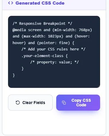
/* Responsive Breakpoint */
@media screen and (min-width: 768px) and (max-width: 1023px) and (hover: hover) and (pointer: fine) {
    .your-element-class {
        /* property: value; */
    }
}
How to Use the CSS Media Query Generator
Step 1: Choose a Breakpoint Preset
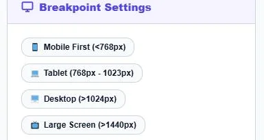
Click a preset: Mobile First (<768px), Tablet (768px – 1023px), Desktop (>1024px) or Large Screen (>1440px). The width fields fill in automatically.
Step 2: Adjust the Conditions
Change Min-Width or Max-Width and their units (px, em or rem), choose a Media Type (All, Screen or Print) and an Orientation (Any, Portrait or Landscape). Tick Include Hover Capability Check to target devices with a mouse or trackpad.

Step 3: Copy the CSS
Generated CSS Code shows the full @media block with a placeholder selector. Click Copy CSS Code, paste it into your stylesheet and replace .your-element-class with your own selector. Use Clear Fields to start again.
Mobile-First vs Desktop-First
| Approach | Base CSS for | Uses | Example |
|---|---|---|---|
| Mobile-first | Small screens | min-width queries | @media (min-width: 768px) { … } |
| Desktop-first | Large screens | max-width queries | @media (max-width: 767px) { … } |
Mobile-first is the most common approach today: write simple styles for phones, then add min-width queries as space grows. The Mobile preset in this tool creates a max-width rule, which is handy for small-screen overrides in a desktop-first stylesheet.
Media Features Explained
- min-width / max-width: the viewport width at which the rule starts or stops.
- Media type: screen for displays, print for printed pages, all for both.
- Orientation: portrait when the screen is taller than wide, landscape when wider than tall.
- (hover: hover) and (pointer: fine): devices with a mouse or trackpad, useful for hover-only effects that should not appear on touch screens.
Tips
- Avoid gaps and overlaps: if one query ends at max-width: 767px, start the next at min-width: 768px.
- Switching the unit does not convert the number. 768px is 48em at the default 16px font size, so type 48 if you choose em.
- em-based breakpoints scale with the user’s font settings, which helps accessibility.
- Choose breakpoints where your layout breaks, not only by popular device sizes.
- Add <meta name="viewport" content="width=device-width, initial-scale=1"> to your page head, or media queries will not work correctly on phones.
Frequently Asked Questions
What is a CSS media query?
It is a CSS rule that applies styles only when the device or viewport matches conditions such as width, orientation or hover capability.
What are standard CSS breakpoints?
Common choices are below 768px for phones, 768–1023px for tablets, 1024px and up for desktops, and 1440px and up for large screens.
Should I use min-width or max-width?
Use min-width for a mobile-first stylesheet and max-width for desktop-first. Do not leave a gap between the end of one range and the start of the next.
What does (hover: hover) mean?
It matches devices whose main input can hover, such as a mouse. Combined with (pointer: fine) it excludes most touch screens.
Can I use em or rem for breakpoints?
Yes. Choose the unit next to each width, and enter the value in that unit, such as 48em for 768px.
Is the CSS media query generator free?
Yes. It is free, runs in your browser and needs no sign-up.