

Responsive Iframe Generator – Make YouTube, Maps and Other Embeds Scale on Mobile in 2 Easy Steps
Responsive Iframe Embed Code Generator
Instantly create perfectly scaled HTML/CSS iframe embed codes for YouTube, Maps, and external sites.
Use this free responsive iframe generator to create embed code that fits phones, tablets and desktops without black bars or overflow.
Quick answer
A responsive iframe sits inside a container that keeps a fixed aspect ratio while the width changes. The container uses position: relative; width: 100%; height: 0; padding-bottom: 56.25% for 16:9, and the iframe inside is set to position: absolute; width: 100%; height: 100%. Paste the embed URL, choose the aspect ratio, add a title, and copy the generated HTML and CSS. Turn Responsive CSS Mode off for a fixed width and height instead.
Table of Contents
Embed codes copied from YouTube, Google Maps, Vimeo or form builders usually have fixed width and height values. On a phone they overflow the screen or leave a tiny frame with huge empty space.
This responsive iframe generator wraps any embed in a scaling container so it always fits its column, and it adds the accessibility title and options you would otherwise need to type by hand.
Aspect Ratio Padding Values
| Aspect ratio | padding-bottom | Typical use |
|---|---|---|
| 16:9 | 56.25% | YouTube, Vimeo, most video |
| 4:3 | 75% | Older video, slides, some maps |
| 1:1 | 100% | Square posts, social embeds |
| 21:9 | 42.85% | Cinematic and ultrawide video |
The padding percentage is height ÷ width × 100. Because padding is based on the container’s width, the box always keeps the same shape.
Example Output
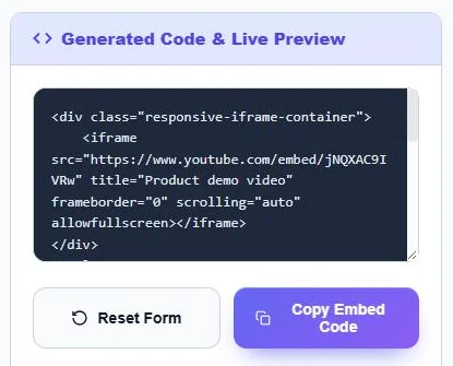
<div class="responsive-iframe-container">
    <iframe src="https://www.youtube.com/embed/VIDEO_ID" title="Product demo video" frameborder="0" scrolling="auto" allowfullscreen></iframe>
</div>
<style>
    .responsive-iframe-container { position: relative; width: 100%; padding-bottom: 56.25%; height: 0; overflow: hidden; }
    .responsive-iframe-container iframe { position: absolute; top: 0; left: 0; width: 100%; height: 100%; }
</style>
How to Use the Responsive Iframe Generator
Step 1: Configure the Embed
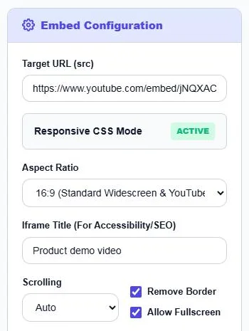
Paste the Target URL (src), such as a YouTube embed or Google Maps embed link. Keep Responsive CSS Mode active, choose an Aspect Ratio (16:9, 4:3, 1:1 or 21:9), type an Iframe Title, and set Scrolling, Remove Border and Allow Fullscreen. Click the Responsive CSS Mode box to switch to fixed width and height.
Step 2: Copy the Embed Code
Generated Code & Live Preview shows the HTML and CSS and renders the embed below it. Click Copy Embed Code and paste it into a Custom HTML block or your template. Click Reset Form to start again.
Modern Alternative: aspect-ratio
Current browsers also support the CSS aspect-ratio property, so you can write iframe { width: 100%; aspect-ratio: 16 / 9; height: auto; }. The padding method used by this generator works everywhere, including older browsers and email-like page builders, which is why it is still widely used.
Which URL Should You Paste?
- YouTube: use the embed form, youtube.com/embed/VIDEO_ID, not the watch link.
- Google Maps: choose Share → Embed a map and copy the src value from the code.
- Vimeo: use player.vimeo.com/video/VIDEO_ID.
- Forms and calendars: copy the src from the provider’s embed code.
Some sites block embedding with security headers. If the preview stays blank, that site does not allow iframes and the code will not work there either.
Tips
- Always add a descriptive title; screen readers announce it to users.
- Use loading="lazy" on iframes below the fold to speed up the page.
- If you add several embeds to one page, the same container class can be reused.
- Embedded videos add third-party scripts; use as few as you need.
Frequently Asked Questions
How do I make an iframe responsive?
Wrap it in a container with position: relative, width: 100%, height: 0 and a padding-bottom equal to the aspect ratio, then make the iframe absolutely positioned at 100% width and height.
What padding is used for 16:9?
56.25%, because 9 ÷ 16 × 100 = 56.25.
Can I make a fixed-size iframe instead?
Yes. Click Responsive CSS Mode to switch it off and set the width and height.
Why is my iframe preview blank?
The site may block embedding, or the URL is a normal page link instead of an embed link.
Does this work for Google Maps?
Yes. Paste the src URL from Google Maps’ Embed a map code and choose 4:3 or 16:9.
Is the responsive iframe generator free?
Yes. It is free, runs in your browser and needs no sign-up.