

Typography Scale Generator – Font Sizes for H1 to H5 in px and rem
Typography Scale Generator
Establish a perfect visual hierarchy for your website. Select a base size and a mathematical ratio to generate harmonious font sizes.
Scale Settings
Ready-to-use CSS
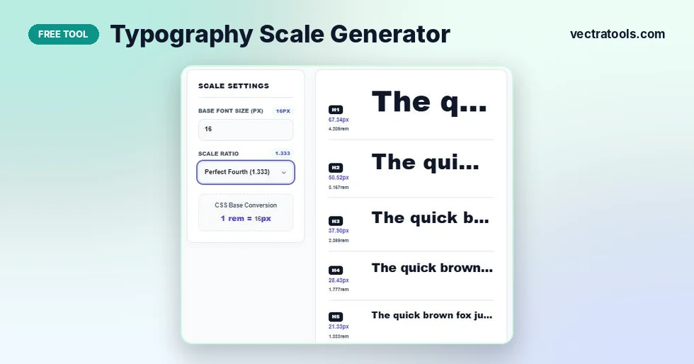
Quick answer
Enter a base font size, such as 16px, and choose a scale ratio like Major Third (1.250). The typography scale generator multiplies the base by the ratio to give sizes for H1 to H5, body text and small text, in both px and rem, with a live preview. Press Copy CSS Variables to get ready-made CSS for your site.
Picking heading sizes by eye usually ends with numbers like 34px, 27px and 22px that do not relate to each other. The page works, but it never quite looks balanced. A type scale fixes this by building every size from one base size and one ratio, the same way musical notes are built from fixed intervals.
This typography scale generator does the maths for you. Change the base size or the ratio and all seven sizes update at once, so you can see the whole hierarchy before you write any CSS.
Scale Ratios Available
| Ratio name | Value | Feel | Works well for |
|---|---|---|---|
| Minor Second | 1.067 | Very subtle | Dense dashboards and data tables |
| Major Second | 1.125 | Subtle | Apps and admin screens |
| Minor Third | 1.200 | Balanced | Blogs and documentation |
| Major Third | 1.250 | Clear | Most websites (default) |
| Perfect Fourth | 1.333 | Strong | Marketing pages and articles |
| Augmented Fourth | 1.414 | Bold | Landing pages |
| Perfect Fifth | 1.500 | Dramatic | Portfolios and editorial layouts |
| Golden Ratio | 1.618 | Very dramatic | Posters and hero sections |
How to Use the Typography Scale Generator
The tool starts at 16px with Major Third (1.250). You can change both settings at any time.
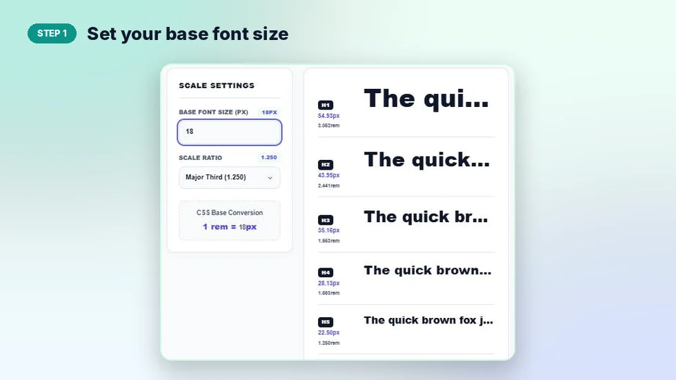
Step 1: Set your base font size
Type your body text size in Base Font Size (px). Most websites use 16px, while 18px suits reading-heavy pages. In the screenshot, 18px with Major Third gives an H1 of 54.93px.
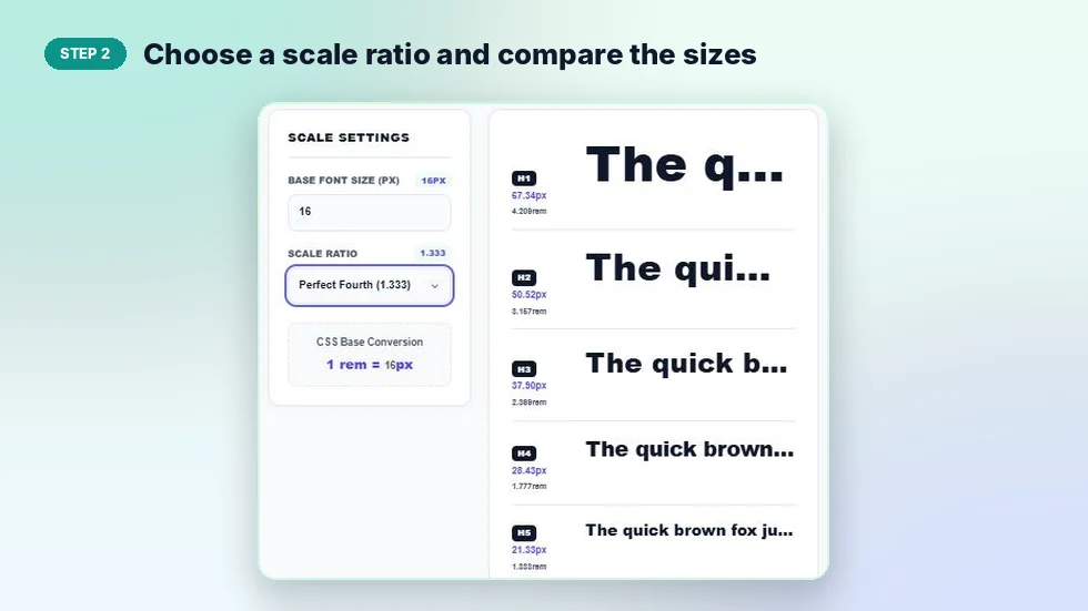
Step 2: Choose a scale ratio and compare the sizes
Open Scale Ratio and pick a ratio. The preview shows each level with its px and rem size. Switch between ratios and watch how the gap between headings grows or shrinks.
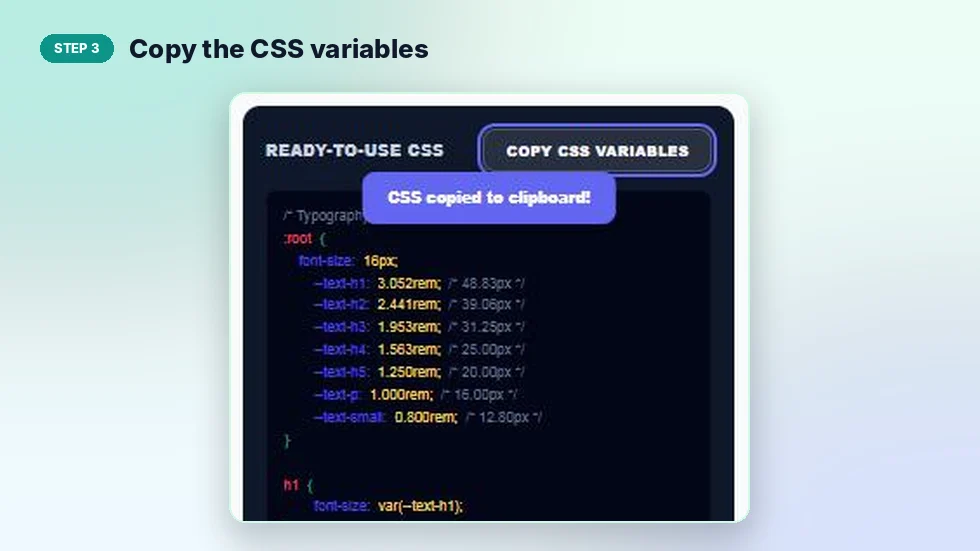
Step 3: Copy the CSS variables
Under Ready-to-Use CSS, press Copy CSS Variables. The code sets a variable for each level, such as --text-h1, and applies them to h1 through h5, p and small.
Example Scales at 16px
These values come straight from the tool. Each level is the one below it multiplied by the ratio.
| Level | Major Third (1.250) | Perfect Fourth (1.333) |
|---|---|---|
| H1 | 48.83px / 3.052rem | 67.34px / 4.209rem |
| H2 | 39.06px / 2.441rem | 50.52px / 3.157rem |
| H3 | 31.25px / 1.953rem | 37.90px / 2.369rem |
| H4 | 25.00px / 1.563rem | 28.43px / 1.777rem |
| H5 | 20.00px / 1.250rem | 21.33px / 1.333rem |
| Body | 16.00px / 1.000rem | 16.00px / 1.000rem |
| Small | 12.80px / 0.800rem | 12.00px / 0.750rem |
How the Scale Is Calculated
Each size is the base size multiplied by the ratio raised to a power. Body text uses power 0, so it equals the base. H5 uses power 1, H4 power 2 and so on up to H1 at power 5. Small text uses power −1, which divides the base by the ratio once.
For H1 at 16px with Major Third: 16 × 1.255 = 16 × 3.052 = 48.83px. The rem value is that size divided by the base, so 48.83 ÷ 16 = 3.052rem.
Tips for Choosing a Type Scale
- Use smaller ratios on mobile. A 1.333 scale can make H1 too large on a phone. Many sites use 1.2 on small screens and 1.333 on desktop.
- Prefer rem over px. Rem sizes respect the reader's browser font setting, which helps accessibility.
- Round if you need to. Rounding 48.83px to 48px will not break the scale.
- Keep line height in mind. Large headings need tighter line height, around 1.1 to 1.2, while body text reads best at about 1.5 to 1.7.
Pair a typography scale generator with good font choices and your pages will look consistent from the first heading to the footer. Choose the fonts first with the font pairing tool, then set the sizes here.
Frequently Asked Questions
Is this typography scale generator free?
Yes. It is free with no sign-up and runs in your browser.
What is a typographic scale?
A set of font sizes built from one base size and one ratio, so every size relates to the others.
Which scale ratio should I use?
Major Third (1.250) suits most websites. Use a smaller ratio for dense apps and a larger one for bold marketing pages.
What base font size is best?
16px is the standard browser default and a safe choice. 18px works well for long articles.
Why does the tool give rem values?
Rem units scale with the reader's browser settings, so text stays readable for people who increase their default font size.
What does the copied CSS include?
A :root block with a variable for each size and rules that apply them to h1 to h5, p and small.