

CSS Grid Generator – Build Grid Layouts Visually
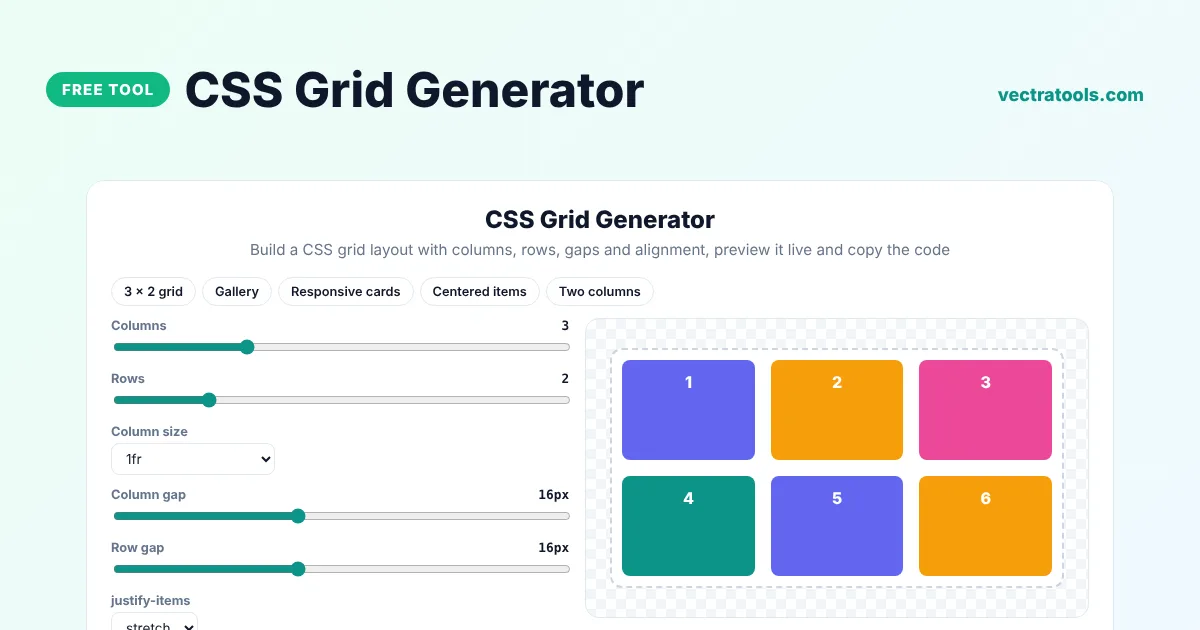
CSS Grid Generator
Build a CSS grid layout with columns, rows, gaps and alignment, preview it live and copy the code
Quick answer
A CSS grid generator helps you create a grid layout without writing every property by hand. Choose the number of columns and rows, the column size, the gaps and how items align, and the tool writes the .grid CSS. Pick the auto-fit option to make a responsive grid that changes the number of columns with the screen width.
Our free CSS grid generator shows numbered items in a live preview so you can see the layout as you build it. It is useful for image galleries, card sections, dashboards, pricing tables and page layouts, and it includes presets you can use as a starting point.
CSS Grid Properties Explained
| Property | What it does |
|---|---|
| grid-template-columns | Sets the number and width of columns, for example repeat(3, 1fr) |
| grid-template-rows | Sets the number and height of rows |
| column-gap and row-gap | Space between columns and between rows |
| justify-items | Horizontal alignment of items inside their cells |
| align-items | Vertical alignment of items inside their cells |
Column Size Options
- 1fr: each column takes an equal share of the free space.
- auto: columns are as wide as their content.
- 100px: fixed-width columns.
- minmax(100px, 1fr): columns are at least 100px but grow to fill the space.
- repeat auto-fit: as many 120px+ columns as fit, which makes the grid responsive without media queries.
How to Use the CSS Grid Generator
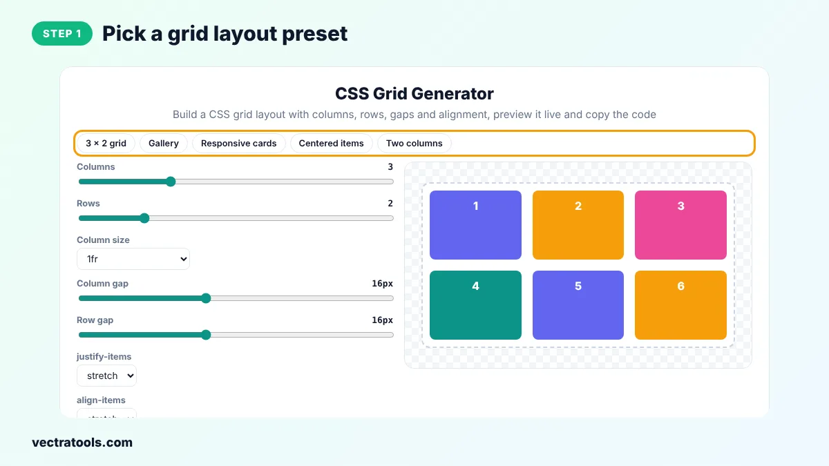
Step 1: Pick a Grid Layout Preset
Click 3 x 2 grid, Gallery, Responsive cards, Centered items or Two columns to load a common layout.
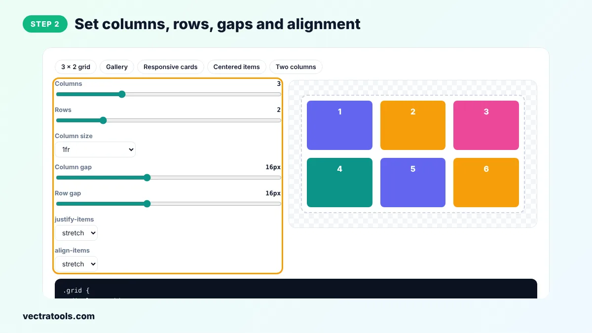
Step 2: Set Columns, Rows, Gaps and Alignment
Drag the Columns and Rows sliders, choose a column size, set the column and row gaps and pick justify-items and align-items.
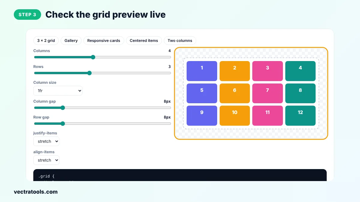
Step 3: Check the Grid Preview Live
The numbered cells in the preview update instantly, so you can see how many items fit and how they line up.
Step 4: Copy the CSS Grid Code
Click Copy CSS and paste the .grid rule into your stylesheet. Add class="grid" to the parent element and put your items inside it.
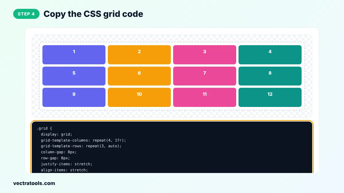
Front-end developers use the CSS grid generator to sketch a layout quickly, and learners use it to see what each grid property does. The CSS grid generator is free, needs no account and creates code you can paste into any stylesheet, Sass file or CSS module.
Common CSS Grid Mistakes
- Putting display: grid on the items instead of on the parent.
- Using percentage widths plus gaps, which makes the grid overflow its container.
- Setting a fixed number of columns that is too many for mobile screens.
- Forgetting that grid items stretch to the row height unless align-items is changed.
Responsive Grid Without Media Queries
.grid {
  display: grid;
  grid-template-columns: repeat(auto-fit, minmax(240px, 1fr));
  gap: 20px;
}
This one rule shows one column on phones, two or three on tablets and more on large screens. Change 240px to the smallest width your cards should have.
CSS Grid Generator Tips
- Use fr units instead of percentages so gaps are taken into account automatically.
- Make an item span two columns with grid-column: span 2.
- Use gap rather than margins on the items to keep spacing even.
- Combine grid for the page layout with flexbox inside each card.
- Set align-items: start if you do not want items in a row to stretch to the same height.
The CSS grid generator writes standard CSS that works in all modern browsers.
Frequently Asked Questions
What is CSS Grid?
CSS Grid is a two-dimensional layout system that places items in rows and columns. You turn it on with display: grid on the parent element.
What does 1fr mean?
fr stands for fraction. 1fr is one share of the free space, so repeat(3, 1fr) makes three equal columns.
How do I make a responsive grid?
Use grid-template-columns: repeat(auto-fit, minmax(240px, 1fr)). Choose repeat auto-fit in the CSS grid generator to get this code.
What is the difference between auto-fit and auto-fill?
Both create as many columns as fit. auto-fit stretches the items to fill empty space, while auto-fill keeps empty columns in place.
How do I make an item span several columns?
Add grid-column: span 2 to the item, or grid-column: 1 / -1 to make it span the full width.
Should I use grid or flexbox?
Use grid for two-dimensional layouts with rows and columns and flexbox for a single row or column of items.
Is this CSS grid generator free?
Yes. It is free, needs no sign-up and runs in your browser.