

Complementary Color Finder – Complementary, Analogous, Triadic and Monochromatic Schemes
Complementary Color Finder
Pick a base color and instantly generate mathematically perfect complementary, analogous, and triadic color schemes for your designs.

Quick answer
Pick a colour with the picker or type a HEX code such as #0D9488 and press Generate Palettes. The complementary color finder shows the complementary colour (180° opposite on the colour wheel, here #940D19), two analogous neighbours (±30°), a triadic set (±120°) and a five-step monochromatic scale. Hover a swatch to see its HEX code and click to copy it.
Colours that sit in specific positions on the colour wheel look good together. Designers use these relationships, called colour harmonies, to build palettes that feel balanced instead of random.
This complementary color finder calculates the main harmonies from a single base colour. It works in the HSL colour model, rotating the hue while keeping saturation and lightness, so every suggestion shares the character of your original colour.
Colour Harmonies Explained
| Scheme | How it is built | Example from #0D9488 | Best for |
|---|---|---|---|
| Complementary | Hue + 180° | #940D19 | Maximum contrast, call-to-action buttons |
| Analogous | Hue − 30° and + 30° | #0D9445, #0D5C94 | Calm, harmonious designs |
| Triadic | Hue + 120° and + 240° | #880D94, #94880D | Vibrant, balanced palettes |
| Monochromatic | Same hue, different lightness | #021716 → #4BEFE1 | Clean, professional layouts |
How to Use the Complementary Color Finder
Start with your brand colour or the main colour of a design.
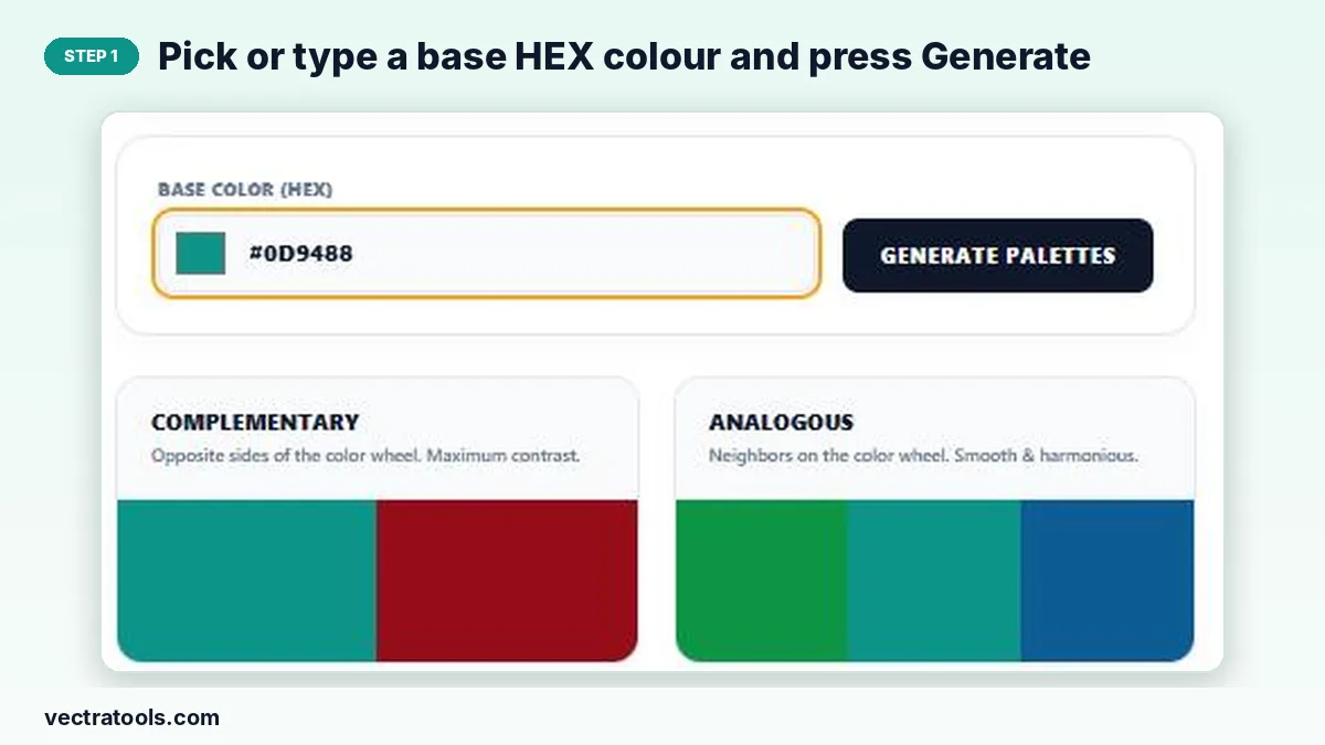
Step 1: Pick or type a base HEX colour and press Generate
Click the colour square to open the picker, or type a HEX code in Base Color (HEX). Press Generate Palettes.
Step 2: Hover a swatch to see its HEX code, click to copy
Move the pointer over any swatch: it widens and shows its HEX code. Click it to copy the code to your clipboard.

Step 3: Compare complementary, analogous, triadic and monochromatic schemes
The four cards show each harmony side by side, so you can choose the one that suits your design.

Tips for Using Colour Schemes
- Follow the 60-30-10 rule: 60% main colour, 30% secondary, 10% accent.
- Use the complementary colour sparingly, for buttons or highlights.
- Check text contrast: light text on light swatches is hard to read.
- Monochromatic scales are ideal for backgrounds, borders and hover states.
Why Use a Complementary Color Finder
Working out colour-wheel angles by hand is fiddly and easy to get wrong. A complementary color finder does the maths instantly and shows the results as real colours, so you can judge them visually. Use this complementary color finder when choosing brand colours, picking an accent for a website or matching a slide deck to a logo.
Frequently Asked Questions
What is a complementary colour?
The colour directly opposite on the colour wheel, 180° away in hue. Complementary pairs create strong contrast.
How does the complementary color finder calculate colours?
It converts your HEX colour to HSL, rotates the hue by the angle for each harmony and converts the result back to HEX.
What is the complementary colour of blue?
On the RGB/HSL colour wheel used by screens, the complement of pure blue (#0000FF) is yellow (#FFFF00).
Can I copy the colour codes?
Yes. Click any swatch to copy its HEX code.
Does it work with RGB values?
Enter colours as HEX. Use the colour picker if you only know the colour visually.
Is the complementary color finder free?
Yes. It is free and runs in your browser.