

Aspect Ratio Resolution Scaler – Resize Without Stretching in 3 Easy Steps
Aspect Ratio Scaler
Use this aspect ratio resolution scaler: define your original ratio, then calculate perfectly scaled dimensions for images and video.
Calculated Decimal Aspect Ratio
Use this free aspect ratio resolution scaler to resize images and video without stretching them. Enter the original width and height (or tap a preset such as 16:9, 4:3, 1:1, 9:16 or 21:9), then type a new width or height, and the tool fills in the matching dimension and shows the decimal aspect ratio.
Quick answer
To keep the same aspect ratio, new height = original height ÷ original width × new width, and new width = original width ÷ original height × new height. Scaling 1920 × 1080 (16:9) to a width of 1280 gives a height of 720. A 9:16 vertical video at 1080 px wide needs a height of 1920 px.
Table of Contents
Resizing for YouTube, Instagram, a website banner or a slide deck often means changing one dimension. If the other dimension is not changed by the same ratio, the picture looks squashed or stretched, or ends up with black bars and awkward crops.
This aspect ratio resolution scaler keeps proportions exact while you type. It works in your browser, with no uploads.
What Is Aspect Ratio?
Aspect ratio is the relationship between the width and height of an image or screen, written as width:height. A 16:9 frame is 16 units wide for every 9 units tall. The ratio says nothing about size; 1280 × 720 and 3840 × 2160 are both 16:9.
The decimal form divides width by height. 16:9 is 1.778:1, 4:3 is 1.333:1 and 9:16 is 0.563:1, which helps compare formats quickly.
Aspect Ratio Formulas
- New height = (original height ÷ original width) × new width
- New width = (original width ÷ original height) × new height
- Decimal ratio = width ÷ height
Common Aspect Ratios and Resolutions
| Ratio | Decimal | Common resolutions | Typical use |
|---|---|---|---|
| 16:9 | 1.778 | 1280 × 720, 1920 × 1080, 3840 × 2160 | YouTube, TVs, monitors, presentations |
| 9:16 | 0.563 | 1080 × 1920 | Reels, TikTok, Shorts, Stories |
| 4:3 | 1.333 | 1024 × 768, 1600 × 1200 | Older screens, iPad, some cameras |
| 1:1 | 1.0 | 1080 × 1080 | Square social posts, profile images |
| 4:5 | 0.8 | 1080 × 1350 | Instagram portrait feed posts |
| 21:9 | 2.333 | 2560 × 1080, 3440 × 1440 | Ultrawide monitors, cinematic video |
Ultrawide monitors marketed as 21:9 are usually a little wider in practice; 3440 × 1440 is about 2.39:1. Use the real pixel size as the original dimensions when you need an exact match.
How to Use the Aspect Ratio Resolution Scaler
Step 1: Enter the Original Size and a New Width
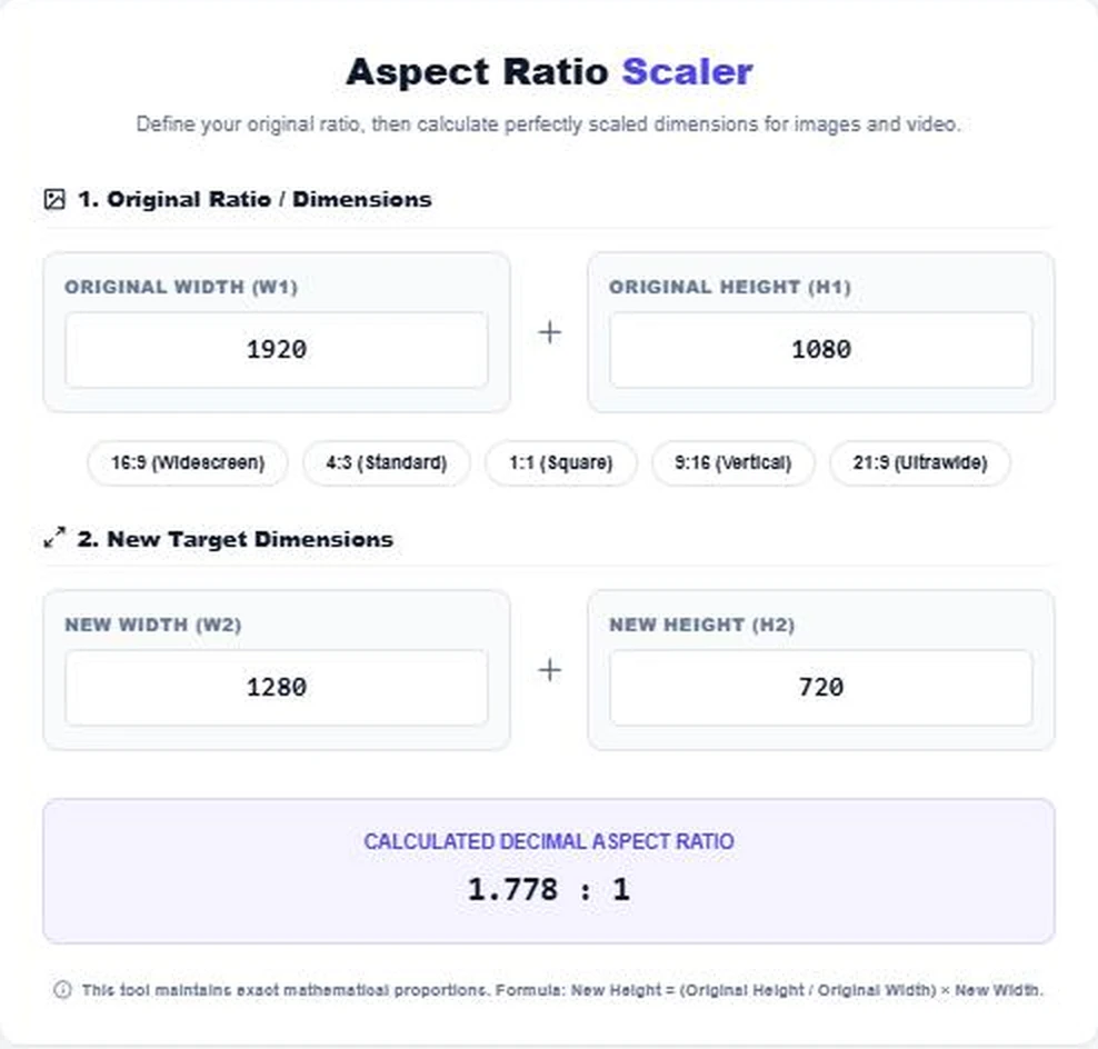
Type the original width and height, for example 1920 × 1080. Then enter the new width you need, such as 1280. The new height fills in automatically as 720, and the ratio panel shows 1.778:1.
Step 2: Use a Preset Ratio
Tap a preset like 9:16 (Vertical) to load that ratio. Enter a new width of 1080 and the tool returns a height of 1920, the standard size for vertical short videos.

Step 3: Scale From the Height Instead
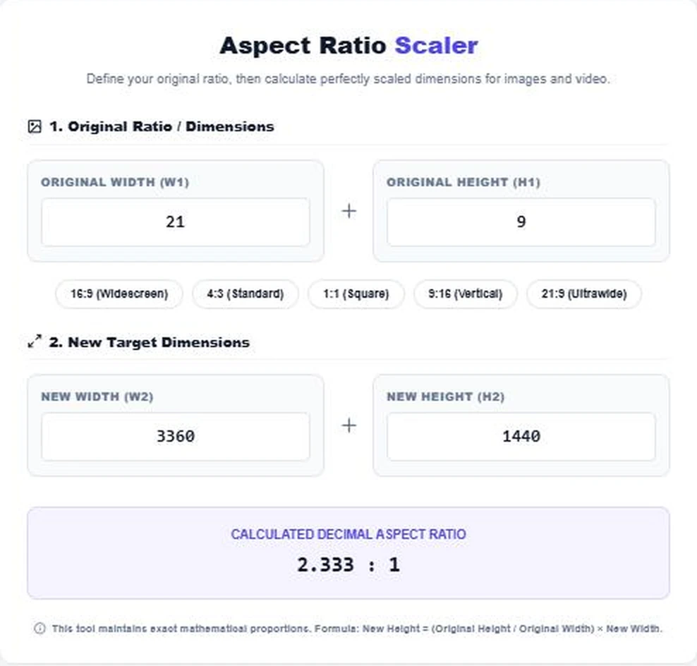
You can also type the height and let the tool work out the width. With the 21:9 preset and a height of 1440, the width becomes 3360 and the ratio shows 2.333:1.
Tips for Resizing Without Losing Quality
- Scale down rather than up when you can; enlarging small images adds blur.
- Round to even numbers for video, since many encoders require even width and height.
- If the target ratio is different from the original, crop first, then resize, to avoid stretching.
- Export a separate version for each platform instead of forcing one size everywhere.
Aspect Ratio for Web and Social Media
For website hero images, 16:9 or wider ratios suit desktop screens, while 4:5 and 9:16 work better on phones. Run each target size through the aspect ratio resolution scaler so headlines and faces stay in frame on every device.
Letterboxing, Pillarboxing and Cropping
When a video or image has a different ratio from the screen, something has to give. Letterboxing adds bars above and below a wide picture on a narrower screen. Pillarboxing adds bars at the sides of a tall or square picture on a wide screen. Cropping fills the screen but cuts off part of the picture. Stretching, the fourth option, distorts everything and should be avoided.
Before you export, decide which approach suits the platform. Social feeds usually prefer cropping to fill the frame, while films and presentations often keep the full picture with bars. The aspect ratio resolution scaler helps you find the exact crop size that matches the target ratio.
Pixels, Resolution and Print Size
Aspect ratio stays the same no matter how many pixels an image has, but print size depends on pixel density. A 3000 × 2000 photo (3:2) prints at 10 × 6.67 inches at 300 pixels per inch. If you scale it to 1500 × 1000 for the web, the ratio is unchanged, but the file is a quarter of the size and only suitable for smaller prints.
Optimising pages too? Compress your stylesheets with the CSS Minifier Online and preview how your site icon looks with the Favicon Previewer.
Frequently Asked Questions
How do I calculate aspect ratio?
Divide width by height for the decimal ratio, or reduce both numbers by their greatest common divisor. 1920 × 1080 reduces to 16:9.
How do I resize an image without stretching it?
Keep the same ratio: new height = original height ÷ original width × new width. The scaler does this automatically.
What size is a 9:16 vertical video?
The standard size is 1080 × 1920 pixels. 720 × 1280 is also 9:16.
Is 1920 × 1080 the same as 16:9?
Yes. 1920 ÷ 1080 = 1.778, which is 16:9.
Why does my result have a decimal?
Some sizes do not divide evenly. Round to the nearest whole pixel, or to an even number for video.
Is any file uploaded?
No. The tool only works with numbers and runs entirely in your browser.